Writing conditional tailwind classNames.
Full-stack developer(Next.js), Blockchain, AI.
You want to add a style to a div when a particular state in your app is true? You can achieve this using this library.
In your Next.js or React app create a folder in root directory and name it as "lib". Inside lib folder create a file named "utils.ts" or "utils.js" based on the language of your choice.
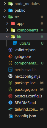
Installing packages
Run this below command to install these npm package:
npm i clsx
npm i tailwind-merge
Below it's explained what these libraries do? skip this section if not interested.
Tailwind Merge.
If you use Tailwind CSS with a component-based UI renderer like React or Vue, you're probably familiar with the situation that you want to change some styles of a component, but only in a one-off case.
// React components with JSX syntax used in this example

function MyGenericInput(props) {
    const className = `border rounded px-2 py-1 ${props.className || ''}`
    return <input {...props} className={className} />
}

function MyOneOffInput(props) {
    return (
        <MyGenericInput
            {...props}
            className="p-3" // ← Only want to change some padding
        />
    )
}
When MyOneOffInput is rendered, an input with the className border rounded px-2 py-1 p-3 gets created. But because of the way the CSS cascade works, the styles of the p-3 class are ignored. The order of the classes in the className string doesn't matter at all and the only way to apply the p-3 styles is to remove both px-2 and py-1.
This is where tailwind-merge comes in.
function MyGenericInput(props) {
    // ↓ Now `props.className` can override conflicting classes
    const className = twMerge('border rounded px-2 py-1', props.className)
    return <input {...props} className={className} />
}
tailwind-merge overrides conflicting classes and keeps everything else untouched. In the case of the MyOneOffInput, the input is now rendered with the classes border rounded p-3.
CLSX:
Usage
import clsx from 'clsx';
// or
import { clsx } from 'clsx';

// Strings (variadic)
clsx('foo', true && 'bar', 'baz');
//=> 'foo bar baz'

// Objects
clsx({ foo:true, bar:false, baz:isTrue() });
//=> 'foo baz'

// Objects (variadic)
clsx({ foo:true }, { bar:false }, null, { '--foobar':'hello' });
//=> 'foo --foobar'

// Arrays
clsx(['foo', 0, false, 'bar']);
//=> 'foo bar'

// Arrays (variadic)
clsx(['foo'], ['', 0, false, 'bar'], [['baz', [['hello'], 'there']]]);
//=> 'foo bar baz hello there'

// Kitchen sink (with nesting)
clsx('foo', [1 && 'bar', { baz:false, bat:null }, ['hello', ['world']]], 'cya');
//=> 'foo bar hello world cya'
API
clsx(...input)
Returns: String
input
Type: Mixed
The clsx function can take any number of arguments, each of which can be an Object, Array, Boolean, or String.
Importa**nt:**Any falsey values are discarded!
Standalone Boolean values are discarded as well.
clsx(true, false, '', null, undefined, 0, NaN);
//=> ''
Modes
There are multiple "versions" of clsx available, which allows you to bring only the functionality you need!
clsx
Size(gzip): 239 bytes
Availability: CommonJS, ES Module, UMD
The default clsx module; see API for info.
import { clsx } from 'clsx';
// or
import clsx from 'clsx';
clsx/lite
Size(gzip): 140 bytes
Availability: CommonJS, ES Module
CAUTION: Accepts ONLY string arguments!
Ideal for applications that only use the string-builder pattern.
Any non-string arguments are ignored!
import { clsx } from 'clsx/lite';
// or
import clsx from 'clsx/lite';

// string
clsx('hello', true && 'foo', false && 'bar');
// => "hello foo"

// NOTE: Any non-string input(s) ignored
clsx({ foo: true });
//=> "
After installing the above packages, paste this code in utils.ts file.
import { type ClassValue, clsx } from "clsx"
import { twMerge } from "tailwind-merge"

export function cn(...inputs: ClassValue[]) {
  return twMerge(clsx(inputs))
}
Now we will create a component to understand how we can use this cn function we created.
Our goal is to create a button that changes it's color from blue to green or green to blue when clicked on it. The completed work will look like this.

Now create a file named "Demo.tsx" and paste this below code in it.
'use client';

import { useState } from 'react';

interface DemoProps {}

export const Demo = ({}: DemoProps) => {
  const [state, setState] = useState(true);
  return (
    <div className='flex'>
      <button
        type='button'
        className='text-white bg-blue-700 hover:bg-blue-800 focus:ring-4 focus:ring-blue-300 font-medium rounded-lg text-sm px-5 py-2.5 me-2 mb-2 dark:bg-blue-600 dark:hover:bg-blue-700 focus:outline-none dark:focus:ring-blue-800'
      >
        Click me to change the color of me
      </button>
    </div>
  );
};
Add this above component to your main component, in our case it's: 'src/app/page.tsx'.
import { Demo } from '@/components/Demo';

export default function Home() {
  return (
    <main className='w-full h-screen flex items-center justify-center'>
      <Demo />
    </main>
  );
}
Now the app looks like this.

Clicking on it will do nothing as of now.
Now go to Demo.tsx and import cn function to it.
import { cn } from '@/lib/utils';
Modify your button to below code.
<button
    type='button'
    onClick={() => setState(!state)}
    className={cn(
        'text-white bg-blue-700 hover:bg-blue-800 focus:ring-4 focus:ring-blue-300 font-medium rounded-lg text-sm px-5 py-2.5 me-2 mb-2 dark:bg-blue-600 dark:hover:bg-blue-700 focus:outline-none dark:focus:ring-blue-800',
        state &&
        'focus:outline-none text-white bg-green-700 hover:bg-green-800 focus:ring-4 focus:ring-green-300 font-medium rounded-lg text-sm px-5 py-2.5 me-2 mb-2 dark:bg-green-600 dark:hover:bg-green-700 dark:focus:ring-green-800'
        )}
>
    Click me to change the color of me
</button>
In the above code we added an onClick event to the button that negates the state value when clicked on it. we modified className to use cn function. The final code looks like this.
'use client';

import { cn } from '@/lib/utils';
import { useState } from 'react';

interface DemoProps {}

export const Demo = ({}: DemoProps) => {
  const [state, setState] = useState(false);
  return (
    <div className='flex'>
      <button
        type='button'
        onClick={() => setState(!state)}
        className={cn(
          !state &&
            'text-white bg-blue-700 hover:bg-blue-800 focus:ring-4 focus:ring-blue-300 font-medium rounded-lg text-sm px-5 py-2.5 me-2 mb-2 dark:bg-blue-600 dark:hover:bg-blue-700 focus:outline-none dark:focus:ring-blue-800',
          state &&
            'focus:outline-none text-white bg-green-700 hover:bg-green-800 focus:ring-4 focus:ring-green-300 font-medium rounded-lg text-sm px-5 py-2.5 me-2 mb-2 dark:bg-green-600 dark:hover:bg-green-700 dark:focus:ring-green-800'
        )}
      >
        Click me to change the color of me
      </button>
    </div>
  );
};
The above code is a React component named Demo. It is a functional component that doesn't take any props. Let's break down the code step by step:
useState Hook: The component uses the
useStatehook from React to create a state variablestateand a functionsetStateto update this state. The initial value ofstateisfalse.JSX: Inside the
returnstatement, the component returns JSX, which represents the UI. It consists of adivelement with a class name of 'flex' and abuttonelement.Button: The button has an
onClickevent handler that toggles the value ofstatewhen clicked. It also has a dynamic class name based on the value ofstate. Thecnfunction is used to conditionally apply class names based on the value ofstate.Conditional Class Names: The
cnfunction is used to conditionally apply class names to the button based on the value ofstate. Whenstateisfalse, it applies a set of classes related to the blue color scheme, and whenstateistrue, it applies a set of classes related to the green color scheme.Button Text: The button text says "Click me to change the color of me".
In summary, this component renders a button that changes its color when clicked, toggling between blue and green, and the color change is reflected in the button's appearance based on the state value.
Summary
Using 'clsx' and 'tailwind merge' we can write conditional classes.